Know how every area is doing, every week.
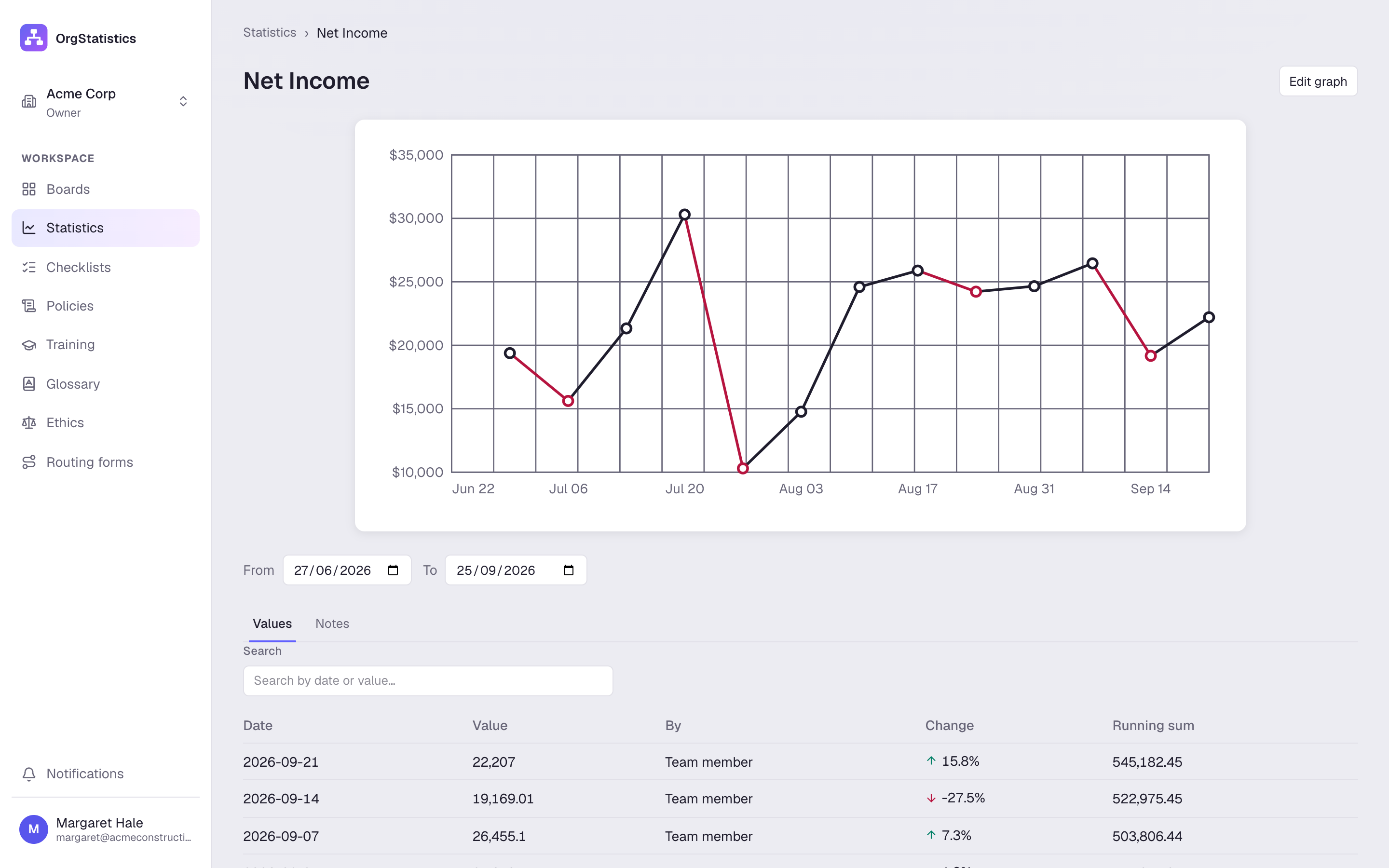
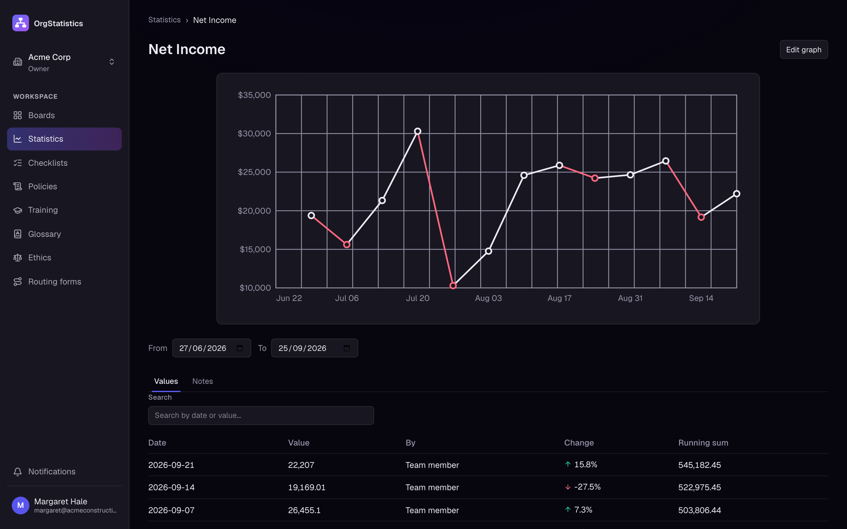
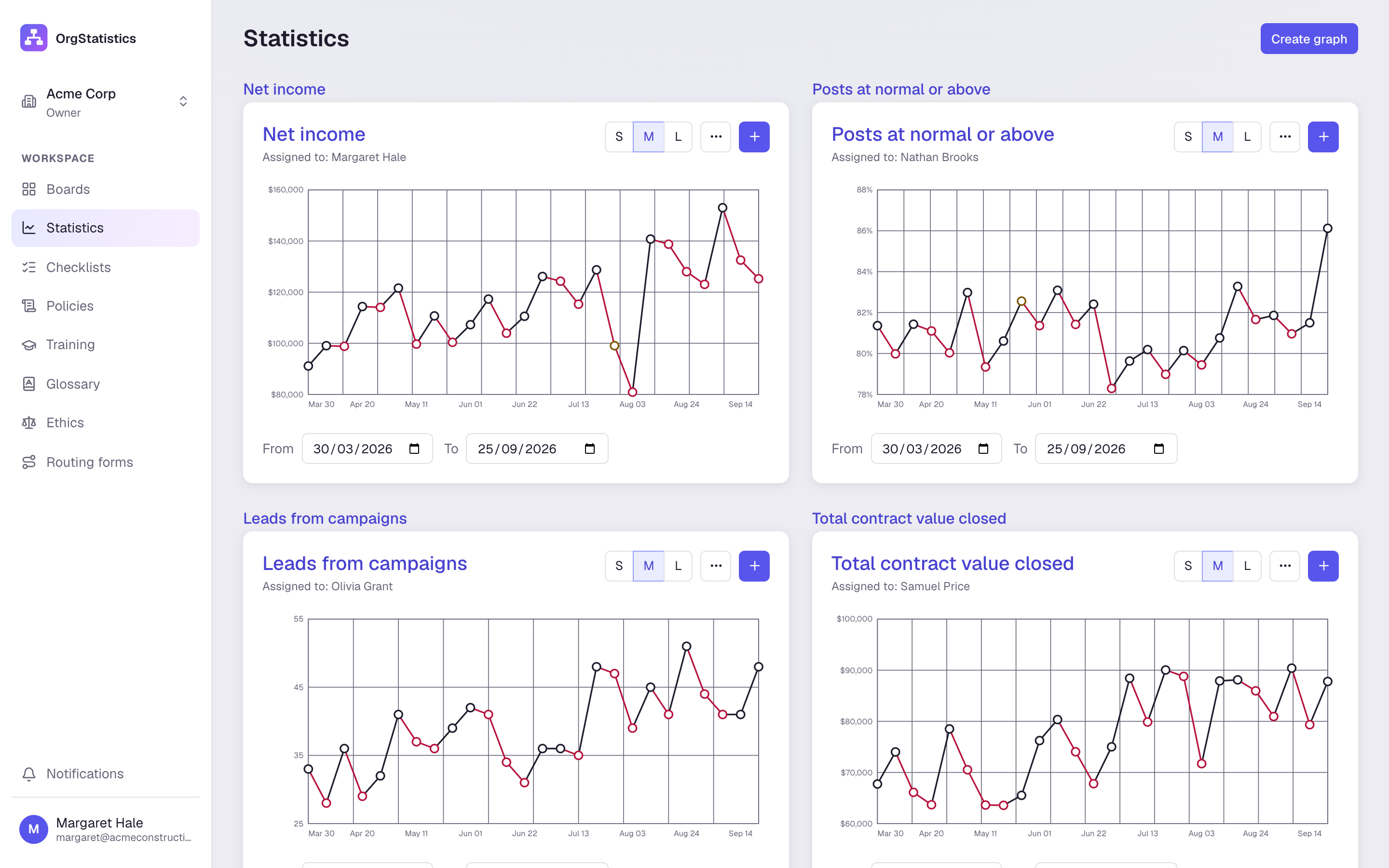
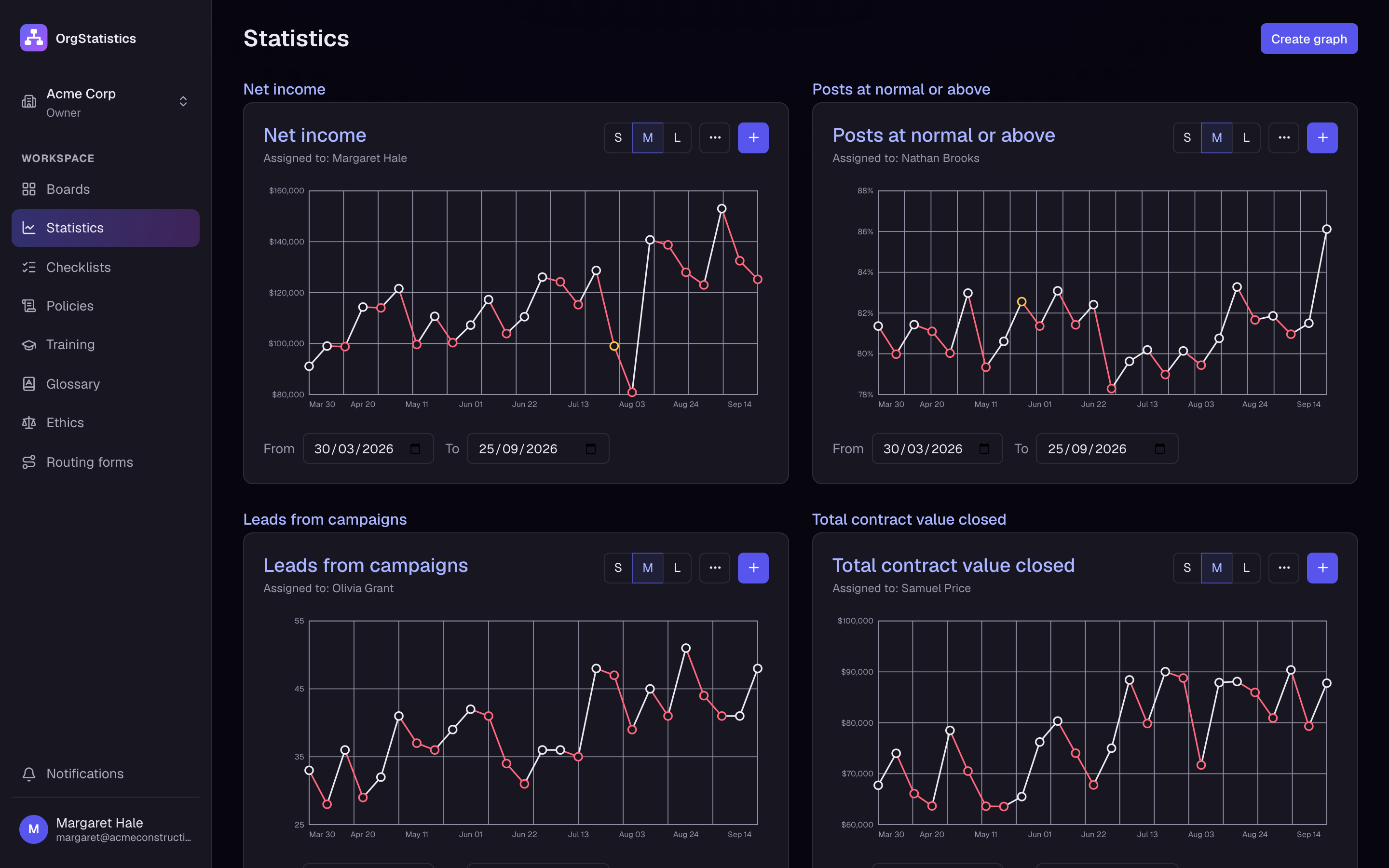
Give each post a statistic and graph it. See at a glance which areas are going up, which are going down, and why.
Every feature is on every plan. See pricing
Try it here.
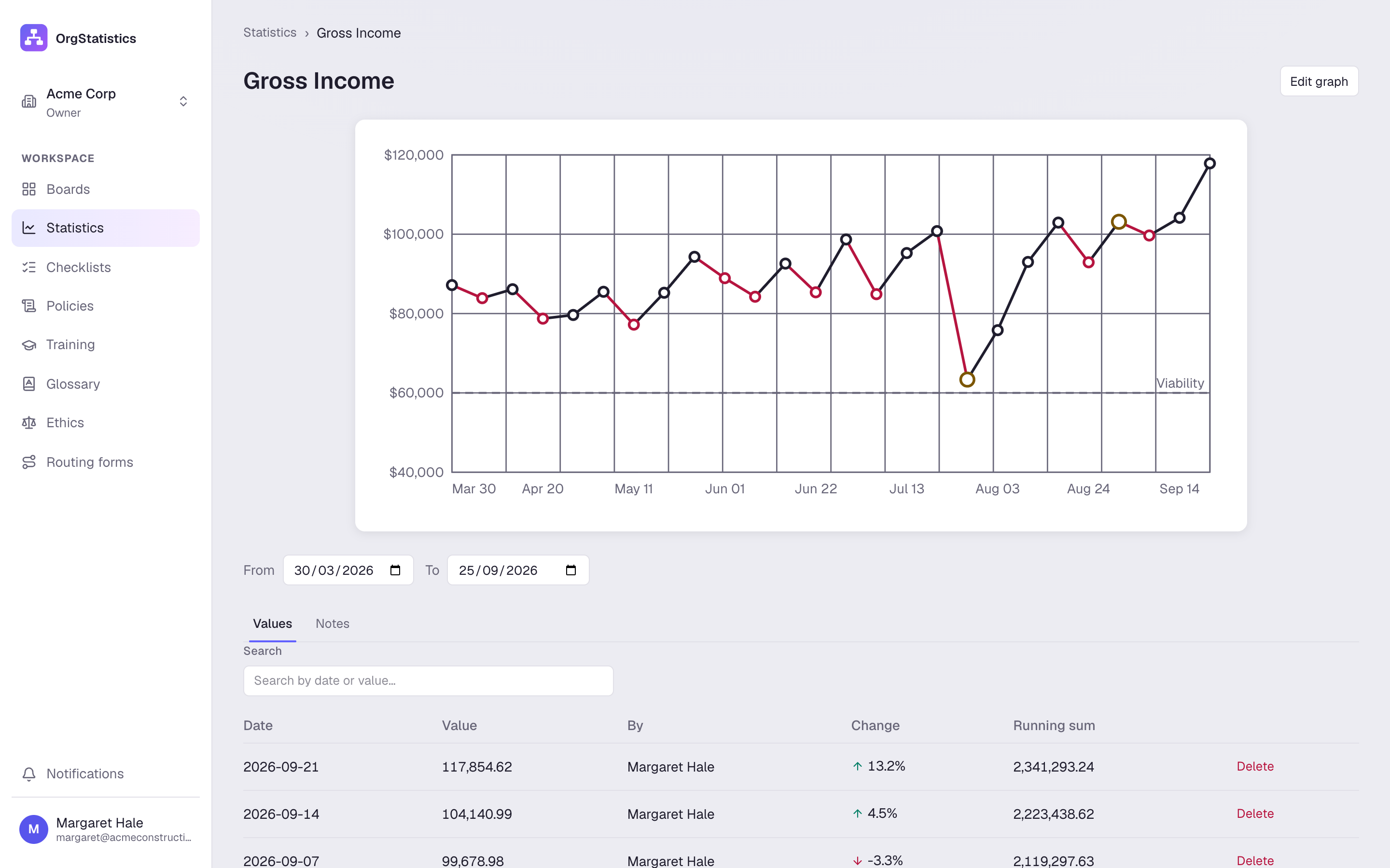
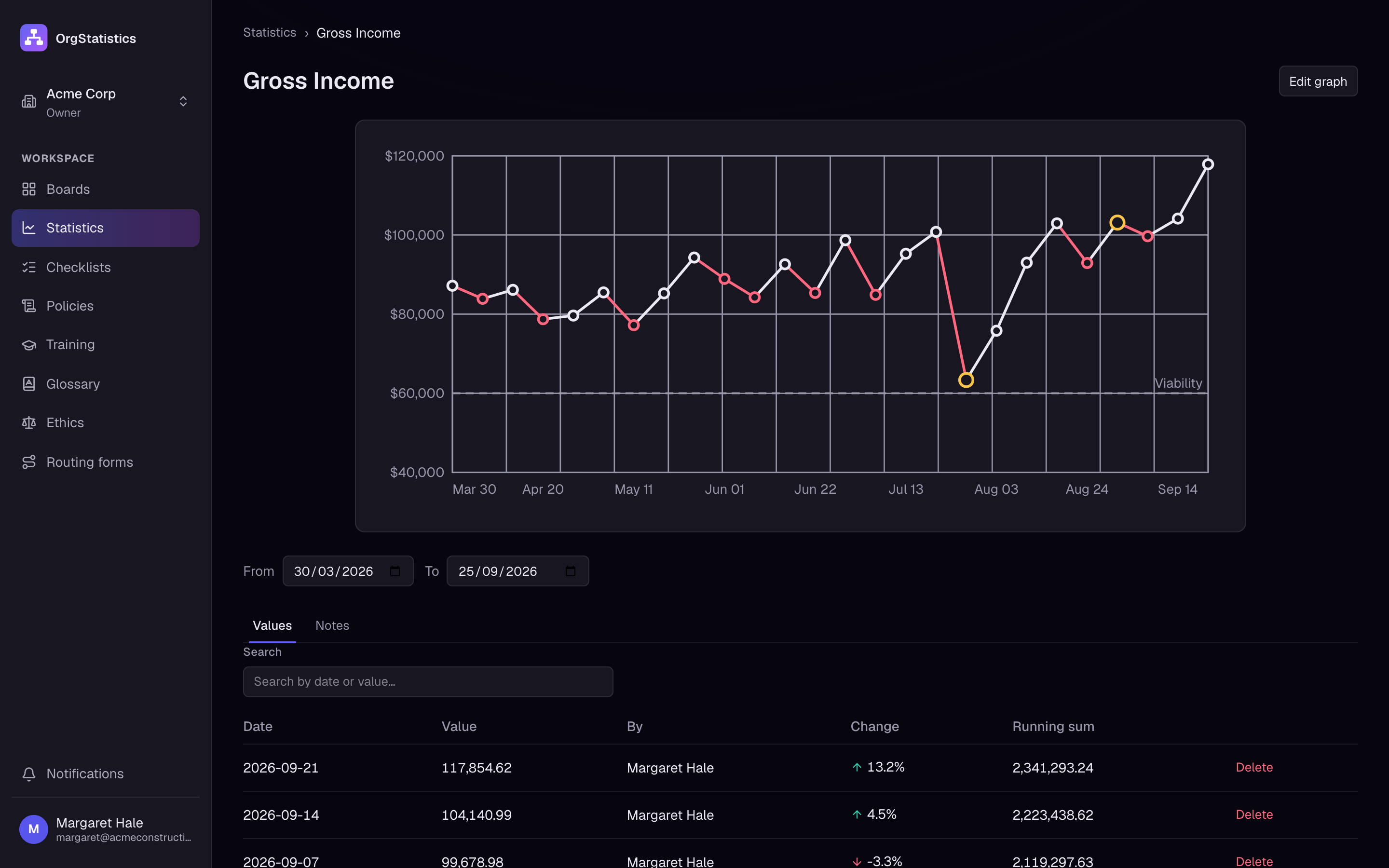
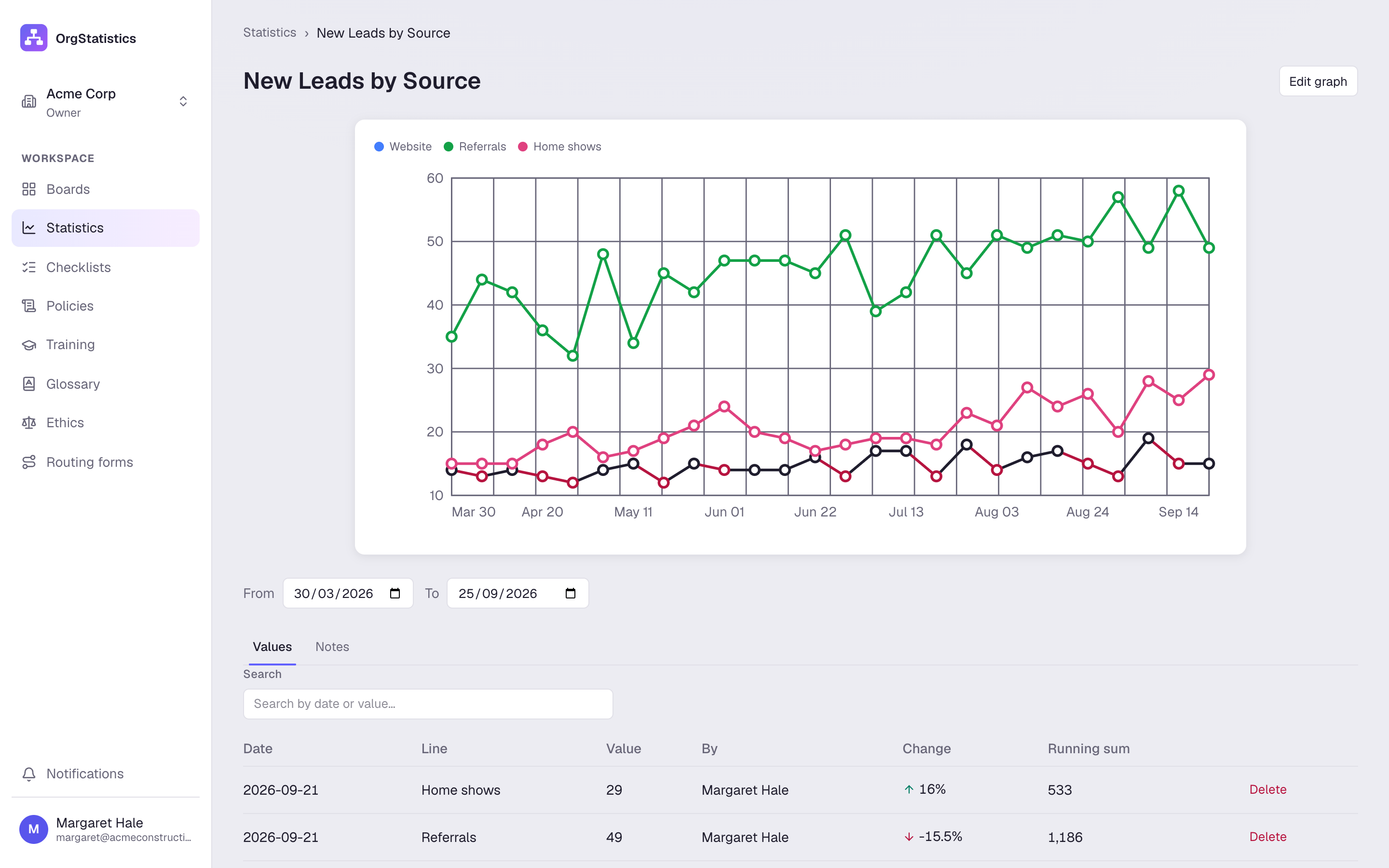
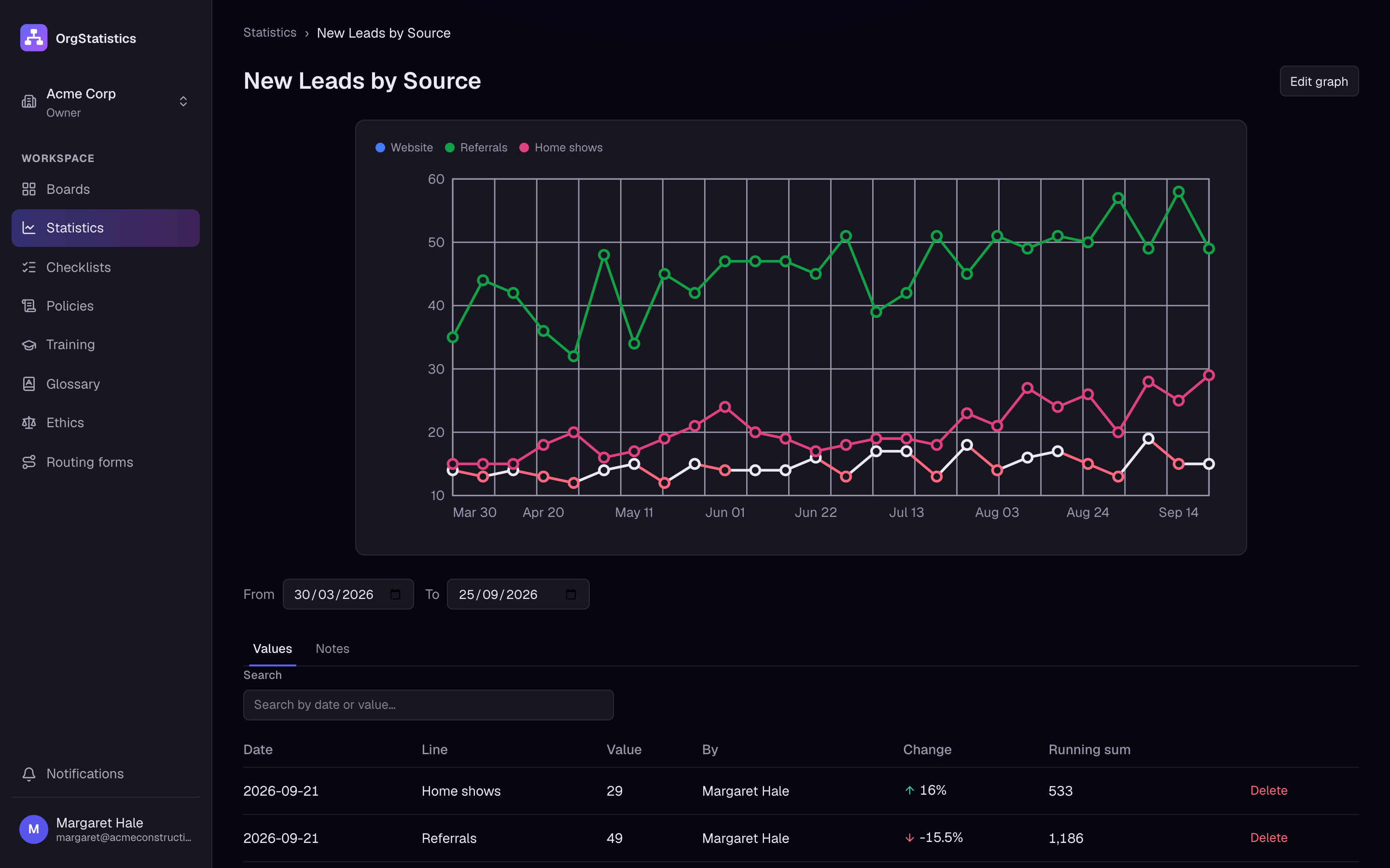
A working copy of the Statistics screen, filled with the Acme Construction demo company. Switch graphs with the tabs above the chart.
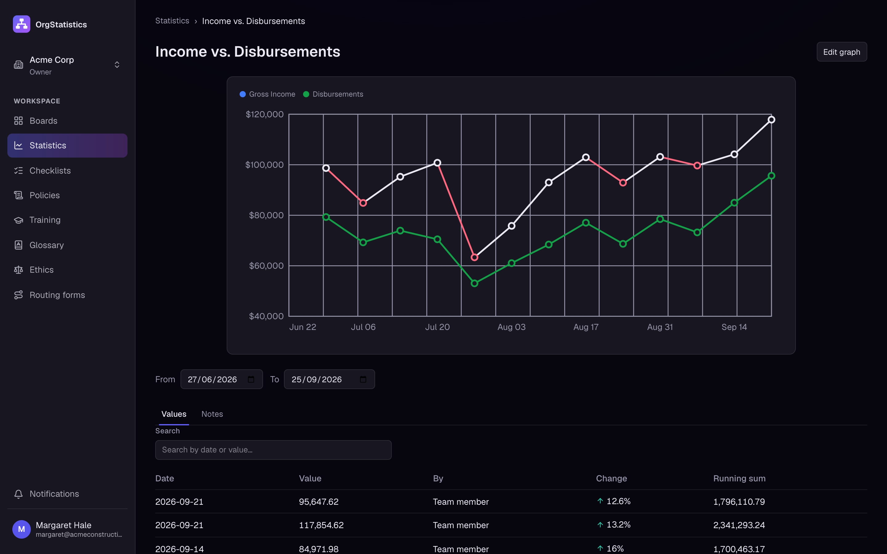
Gross Income
Samuel Price · Div. 3 Treasury · weekly
$114,787▲ 8% this week
New Leads by Source
Olivia Grant · Div. 2 Dissemination · weekly
71▼ 3% this week
- Website
- Referrals
- Home shows
Recordable Safety Incidents
Priya Nair · Div. 5 Qualifications · weekly
0▲ 0% this week
What you can do
- Daily to yearly
- Graph by day, week, month, quarter or year, in numbers, money or percent. Set which days your company operates.
- Several lines on one graph
- Track related values side by side, like new leads from the website, referrals and home shows.
- Linked and equation graphs
- Put two graphs on one chart, or build a graph from a formula such as Gross Income minus Disbursements.
- Targets and viability
- Draw a running target for the week or month, and a viability line that shows the level the area must stay above.
- Notes on the line
- Explain a dip or a jump right on the graph. A dot marks the note; hover it to read it.
- Linked to posts and people
- Link a graph to the post it measures and the person who reports it. Members can add values to their own graphs.

Pricing
From $25 a month for up to 8 users.
Every feature on every plan. Try it free for 14 days, no card needed.